Welcome one and all to the first and only actual competition this Fanon Con! The theme this time around is Cosmos and I absolutely love space-theme art work. It may be no surprise that I'm a massive sci-fi fan and as part of the starfields in particular are a favourite aesthetic of mine, so I jumped at the opportunity to judge this one!
Fourth Place[]
| Ethan's Entry |
|---|
|
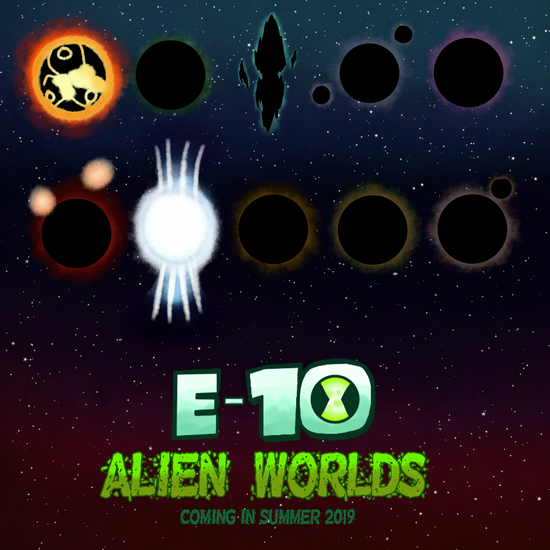
Ebomnitrix here, saying I'm proud to announce that E-10: Horizons will be doing Alien Worlds! The crew and I will be adapting various planets based on Ethan's transformations, including planets that have yet to be discovered! Since the theme is all about cosmos, I thought it'd be fun to tease all 10 alien planets here and what they're each designed to look like, some more interesting than others. |
This one has some ups and downs. But hey, it's the first thing people are gonna read in this blog (assuming they expand the window).
Nice logo, but it doesn't really evoke a theme of the greater universe as this miniseries would be exploring. Honestly I'd suggest maybe taking another look at this design. It's too developed to be a slap-dash "this'll do"-type deal like I made for Ben 10: Delta Days but also not really fitting in the context of what it's preceding.
I do like the starfield background, the gradient is a nice touch to prevent it from feeling like and empty blank slate and the red lower half does a good job of making the universe feel that bit more alien, given that a red sky is something seldom seen at night on Earth. (I'm talking way past Sunset before some smartass comments on that.) The planets... I like considerably less. They all look unique, but I can't really give you credit for that when seven out of ten of them are black spheres with different coloured atmospheres. These designs don't give me much hope for the series when Pyros and Petropia look identical to canon, though I don't think there's much you can do with Pyros to be fair.
That other star one does intrigue me though. And as I'm writing this I've realised what it is and that's pretty clever. My theory is that it is Lodestar's homeworld, a powerful Magnetar (a really messed up Neutron star) where the Biosovortians evolved to manipulate its magnetic fields. Those jets would be the Gamma Ray Bursts created at the poles of the star under its intense magnetic field. Or it could just be the new Amperi homeworld, since in canon they live on a planet orbiting a regular Neutron star.
I'm only going to touch on the advertising aspect of this very briefly to avoid looking like a hypocrite. Ethan, from me to you, this is not a great way of incorporating your series into this contest. It's an advert plain and simple, and your refusal to actually show any of the worlds you could avoid showing (i.e. the eight that aren't stars and therefore can be silhouettes) means that you haven't actually shown anything new about your universe through this piece. I am not detracting or adding any points for the text added in this post.
Third Place[]
| CaT's Entry |
|---|
|
From the unexplored depths to the unknown beyond, the ocean reflects the cosmos in more ways than one. |
Gotta be honest, I'd be totally lost without that caption there. Good save.
This entry suffers from having a good idea but executing it poorly. So at least it's accurate to the franchise we like here. The (what I might be wrong in assuming are) mountains and ocean really benefit here from the more scratchy art style, however I personally feel that that style carrying over to the universe above makes the image blend together too well. If the sky above looked smoother it'd be far easier to distinguish from the ground. As it is now it kinda just looks like a graze across the sky with some white blotches. Actual galaxies look more like clouds, even from a planets surface.
Look man I know you're grappling with the idea of losing your talent to depression, but you are NOT a bad artist. I know I shit on a lot of your stuff often for petty reasons but only because I know you're better than me and I want to see you continue to improve. Also because I'm a jerk. You're drawings throughout inktober/drawtober have been great even though I don't comment on them, I just think this one singular piece isn't that great. Just please PLEASE never stop trying. Even if you hate what you draw. You and I are both artists, we know that hating our work is a part of the growth pattern but I stopped drawing and you didn't. You improved and I haven't. You have so much more patience and dedication to your art than I do and for that I have always envied you.
Second Place[]
| Brandon's Entry |
|---|
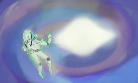
"Oh my God - it's full of stars!"
Although this piece imo falls short of the grand scale that the theme name implies, I think the relative intimacy of this drawing is a huge part of its appeal. And the other part is its implied narrative but actual lack thereof. I don't know what Brandon wanted us to believe was going on here, but the mystery lets me fill in the blanks on my own and for that I strongly appreciate this piece. They say that good art makes you think, and that's what this entry does. Good work Brandon.
Want to know what I think is going on here? My quote at the beginning was a clue. My first thought was that perhaps the character had just fallen into, or was about to fall into, a wormhole. Now that I've thought about it a bit more, I feel like a more fitting narrative would be that the character has lost his ship and is drifting through a nebula. He has just found the source of the nebula, a neutron star now consuming the nebula back into its mass having ejected it during a supernova event previously. Idk toying with what it could mean is fun to me.
First Place[]
| BoaringDay's Entry |
|---|
On the flipside, Boaring has managed to completely capture the idea of scale that 'cosmos' implies and it works oh so well. I feel like I don't even need to justify why this entry won, so let me quickly summarise the things I like, and the things I think could be improved on.
I liked:
- That subtle but beautiful Celestialsapien redesign.
- The sheer size of that Celestialsapien, something I believe more accurately portrays their power and influence than most depictions actually demonstrate.
- The wonderful use of blues, blacks, purples, and white.
- The subtle narrative that portrays this titan as a great creator, at least as I perceive it.
There are only two things that I do not like, both minor. Firstly the starfield looks scratchy again, like CaT's. While it's more subtle here, it's still not quite how the universe looks. And the perspective on that arm is a little wonky, though I'm not sure if that's down to the outline or the shading here.
Congratulations Boaring, absolutely phenomenal work here! And that extends to CaT, Brandon, and Ethan too! A lot of creativity and talent on display for this contest, it was a joy to judge the entries!


